14 Copywriting Examples From Businesses With Incredible Copywriters
We’re all familiar with Flo from Progressive, right?
Stephanie Courtney, the actress that plays her, makes Flo memorable by capturing Flo’s quirkiness — appearing in everything from commercials to print ads, and social media posts.
And do you know who is behind all of that marketing collateral?
Copywriters. The ability to find the exact right words to tell your company’s story isn’t an easy feat, and it’s even harder to do so consistently.
So when we come across companies that are doing it successfully, we think their copywriters deserve a pat on the back (and a raise?). Take a look at some of the companies we think have stellar copywriting, and if you’re looking, maybe get some inspiration for your own brand, too.
1. Omsom

Why we like it: Omsom’s copy is playful and authentic. Company founders, the Pham sisters, are able to share a bit about their culture, the ingredients, and make home cooking accessible and quick for visitors of all skill sets.
I typically enjoy cooking, but I don’t always have the time. Omsom has made me step my game up. Their ready-to-use starter pouches of spices and sauces have helped me churn out Asian dishes quickly minus the hassle of store-hopping and buying larger quantities than I need. Still, I always end up buying more than intended when I’m on their site because it not only looks delicious, but the copy is a huge motivator to click add-to-cart.
Right at the start, the homepage (pictured above) invites you to “rip, pour, and fire it up” and get ready to stuff your face. By focusing on ease and three simple steps, they’re able to make the value proposition that their product is not only tasty, but time efficient.

There’s also plenty of wordplay used. The founders, who have the last name Pham have worked it into various spots on the site, including their note welcoming visitors to their “Phamily.”
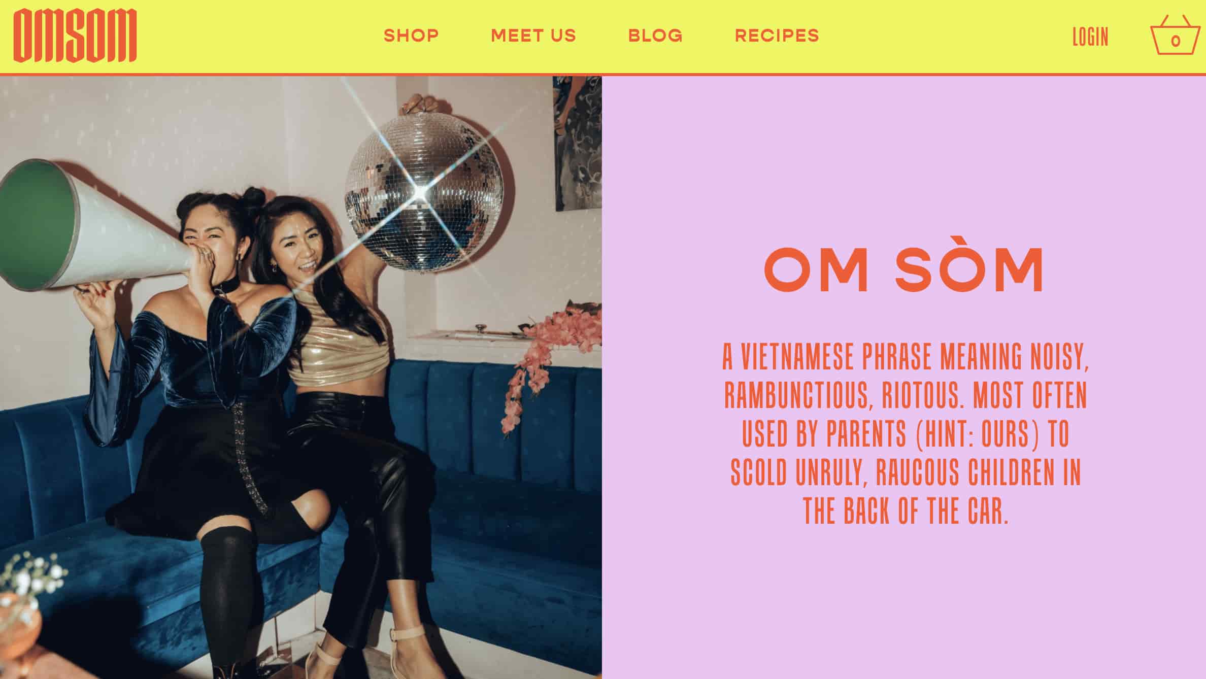
The language is the perfect balance of both playful — even calling out that the Pham sisters were rowdy youths in their definition of Omsom (above) — and no nonsense when it comes to ingredient quality.
2. Articulate
Why we like it: Articulate has nailed the pun game. It’s cheesy in a good way, and makes them more relatable to job seekers. Most people don’t want to just be a cog in a company’s machinery, so by adding some humor, Articulate sets itself apart from other corporate competitors.
Articulate, a HubSpot Agency Partner based in the U.K., is an inbound marketing agency, and their website copy is full of witty, confident copy on pages where you wouldn’t think you’d find it. Here’s exhibit ‘A’:
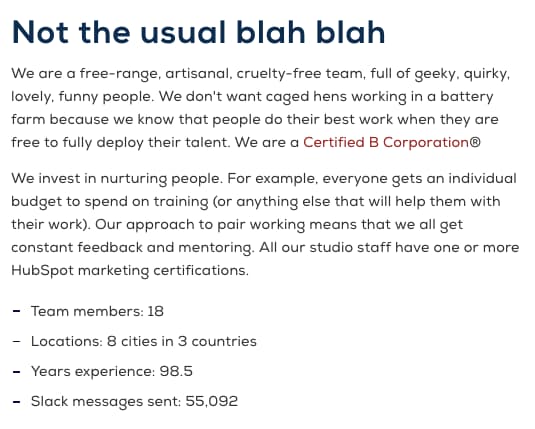
The copy above introduces Articulate’s “Meet the Team” page — not a page you’d think can pull off witty copy, right? Well, Articulate’s page goes beyond employee photos and their job titles.
In addition to the playful header, “not the usual blah blah,” the copy above takes on a farm theme, assuring visitors that employees aren’t simply “caged hens.” Rather, they’re a “free-range, artisanal, cruelty-free team.” Funny on the surface, but helpful to job seekers who, much like food, want to know where their work comes from and how it’s made.
3. Moosejaw
Why we like it: Moosejaw’s use of humor builds an emotional connection with site visitors — delighting them while providing information they can use.
Not many brands are brave enough to touch the products they’re selling with unconventional copy … but Moosejaw isn’t afraid to have a little fun.
The outdoor apparel outlet store uses humor as a way to sell their products without being overly forward about it. By appealing to people’s emotions, they’re more engaging and memorable.
Here are a few examples:
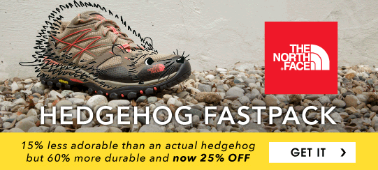
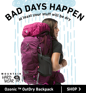
Same goes for the call-to-action buttons that show up when you hover your mouse over a product photo — like this one, which reads, “Look This Cool.”

Does their brand voice carry over to the product descriptions, you ask? See for yourself:
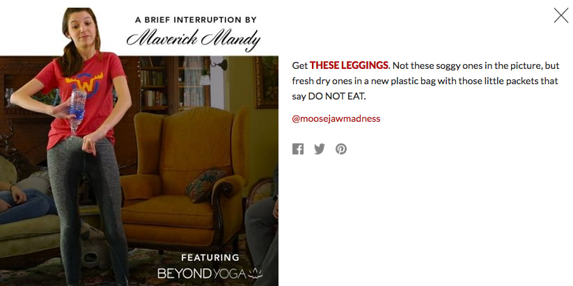
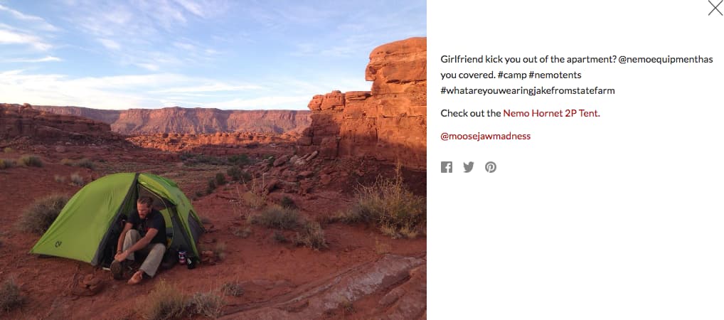
If you think the brilliant copy stops at their homepage, think again. They extend it to their return policy, too. Here, they do a great job of not sacrificing clarity for humor. Their copywriters successfully made people laugh while still being helpful.

4. First Round Capital
Why we like it: First Round Capital uses language to empathize with their readers. Starting a company is challenging, and First Round Capital understands that and conveys they are there to help.
While a sign of great copywriting is making people smile, another is making people feel understood. The copywriters at First Round do a phenomenal job at letting the value of their offerings for their customers sell themselves.
For example, they hold over 80 events every year connecting their community together. Instead of just explaining that they have events and then listing them out, they begin that section of their website with a simple statement that hits close to home with many entrepreneurs: “Starting a company is lonely.”
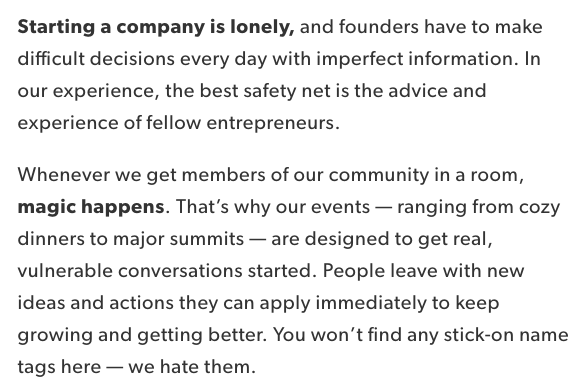
Using words like “imperfect,” “safety net,” and “vulnerable” encourages readers to let their guards down and feel understood by the brand and their community.
Plus, you’ve gotta love that last line about stick-on name tags. Those things get stuck in my hair.
5. Trello
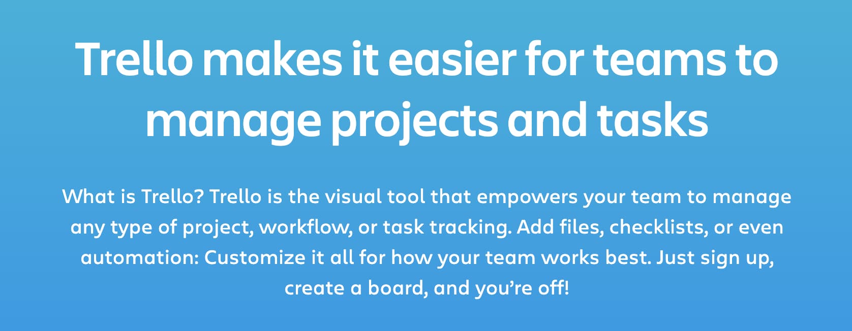
Why we like it: Trello’s text is clear and concise, which is exactly what users need in order to learn how to use the product. Switching project management software can be a challenge. Trello’s copy makes sure new users don’t get left behind.
Do you know what Trello is? If the answer is no, then behold the copywriting on their website. Their product description — like most of the copy on their site — is crystal clear:
And then check out how clear this explainer content is:
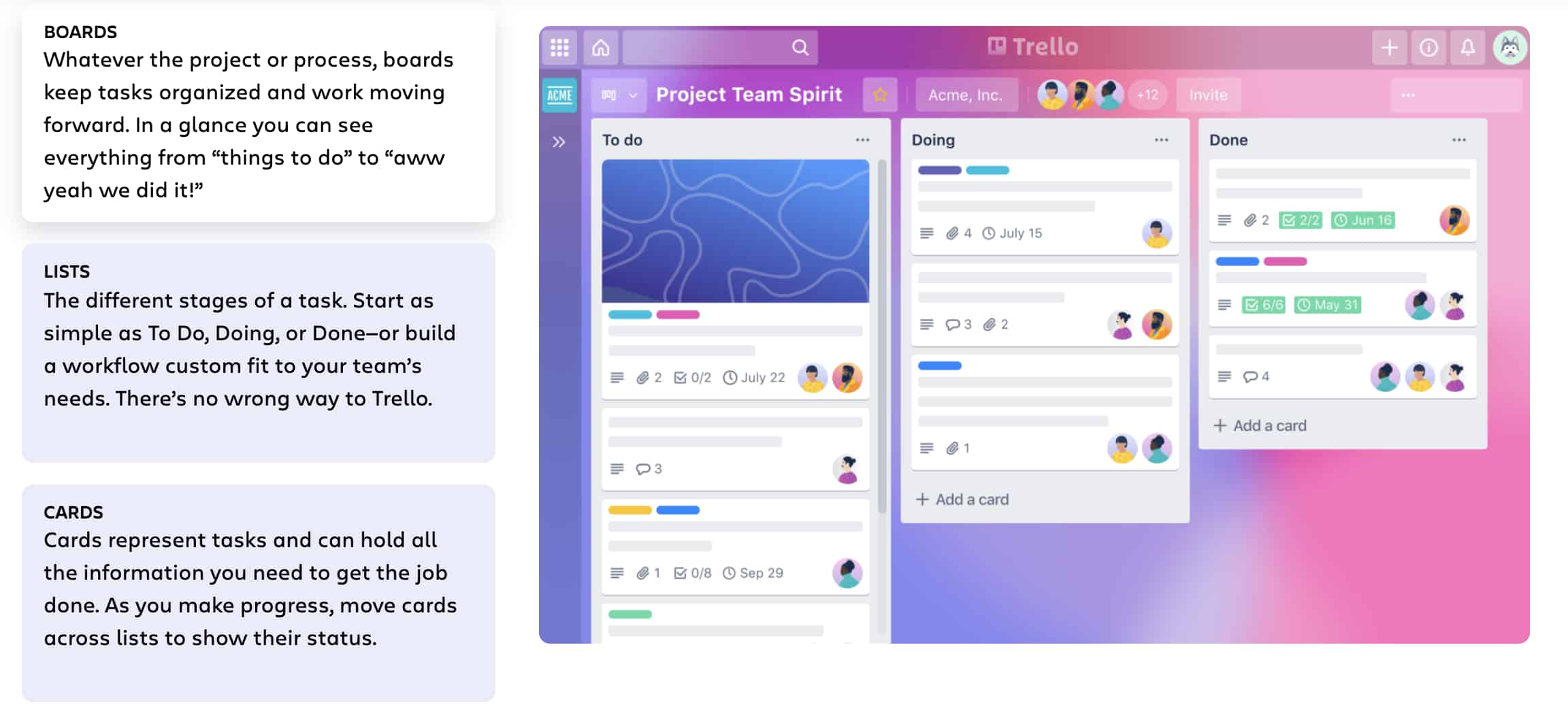
Some of the use case clarity can be attributed to how smart the product is, but I think copywriters deserve some credit for communicating it clearly, too. They call it like it is, which ultimately makes it really easy to grasp.
And I couldn’t write about the copywriting talent at Trello without including the clever references in the microcopy of their login page:
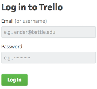
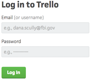
Each time you refresh the login page, you see a different, equally clever example email belonging to a fictional character, like Ender from Ender’s Game and Dana Scully from The X-Files — a great example of nostalgia marketing. This is a small detail, but nonetheless a reminder that there are real humans behind the website and product’s design. Delightful microcopy like this kinda feels like I just shared a private joke with someone at the company.
6. Velocity Partners
Why we like it: For David Kessler of Velocity Partners, less is more. His use of “word economy” delivers engaging, powerful content in a concise manner.
No post from me about excellent copywriting would be complete without mentioning the folks at Velocity Partners. A B2B marketing agency out of the U.K., we’ve featured co-founder Doug Kessler’s SlideShares (like this one on why marketers need to rise above the deluge of “crappy” content) time and again on this blog because he’s the master of word economy.
What is “word economy”? It’s taking care that every word you use is the right word. It means getting your point across concisely and not dwelling on the details when you don’t have to. In a world of shortening attention spans, this is the ultimate goal when communicating your message.
And since we’re talking about word economy, I’ll shut up and let you check out one of Kessler’s SlideShares for yourself:
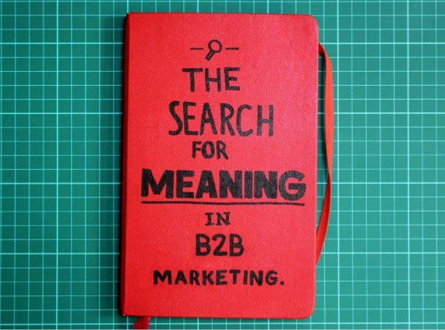
Whereas SlideShares are typically visual, Kessler’s is heavily focused on copy: The design stays constant, and only the text changes. But the copy is engaging and compelling enough for him to pull that off. Why? Because he uses simple words so his readers understand what he’s trying to say without any effort. He writes like he speaks, and it reads like a story, making it easy to flip through in SlideShare form.
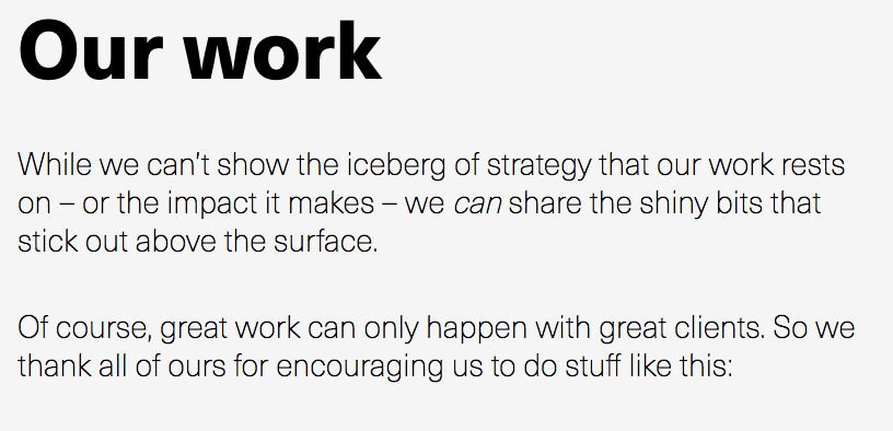
The copy on Velocity Partners’ homepage stood out to me, too. Check out, for example, how humble they are when introducing their case studies:
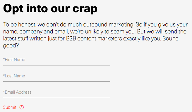
I also like how casual and honest they kept their email subscription call-to-action. The header is especially eye-catching — and it plays off of the popular SlideShare about crappy content we mentioned earlier.
In fact, Velocity Partners’ Harendra Kapur wrote a blog post on what goes into to great B2B writing — starting with this disclaimer, of course.

7. Scott’s Cheap Flights
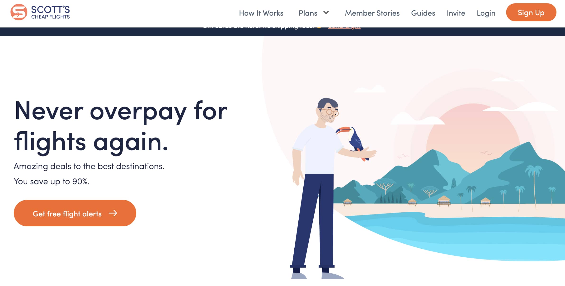
Why we like it: The team at Scott’s Cheap Flights positions themselves as travel industry insiders with their handy pro-tips and down to earth lingo.
Scott’s Cheap Flights is known for finding discount airfare, but they’ve branched out with a variety of offerings, including guides. Adding a personal touch, the team at Scott’s has also offered up some pro tips of their own on their “Meet the Team” page.
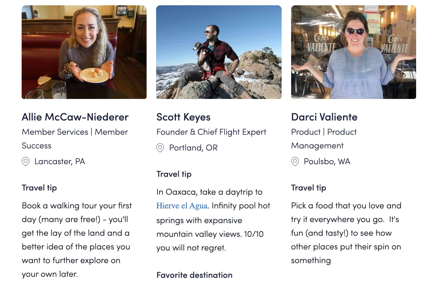
Members feel like they’re getting information from seasoned experts, and they’re able to pair these tips with photos of the employee that gave them. This small, but useful addition builds connection with site visitors and improves the company’s credibility.
8. Cultivated Wit
Why we like it: Cultivated Wit’s site copy is very on brand — humorous and witty. What better way to convey what you can offer to visitors than by demonstrating it in real time?
The copywriters over at the “comedy company” Cultivated Wit do a great job of embracing their own brand of quirk throughout their site. They already have one of the best “About” pages in the game, but their delightful copy is spread throughout their site — sometimes in the most unexpected of places.
For example, take a look at the copy around contact information at the very bottom of their homepage:

This section of the homepage is an afterthought at best for most companies. But for these folks, it was an opportunity to have a little fun.
They also have two, unique email subscription calls-to-action on different pages of their website. They’re very different, but both equally funny and delightful. Here’s one from the homepage:

And one from the “About” page:
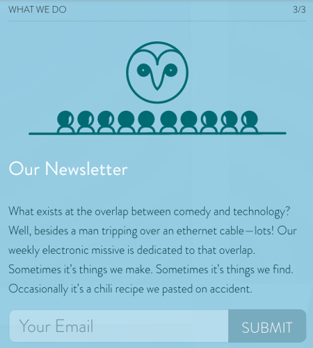
9. Cards Against Humanity
Why we like it: Their copy is abrasive and a little offensive, which perfectly lines up with their brand voice and audience.
You may or may not be familiar with Cards Against Humanity, the self-declared “party game for horrible people.” It’s a card game — one that’s simultaneously entertaining and inappropriate. The copywriting on the cards themselves are guaranteed to make you laugh.
The brand voice is very distinctive, and can seem a little abrasive, and even a little offensive. But that’s their whole shtick: They’re not trying to appeal to everyone, and that’s perfectly okay. What they do do a great job of doing is appealing to their target audience.
One look at their FAQ page and you’ll see what I mean:
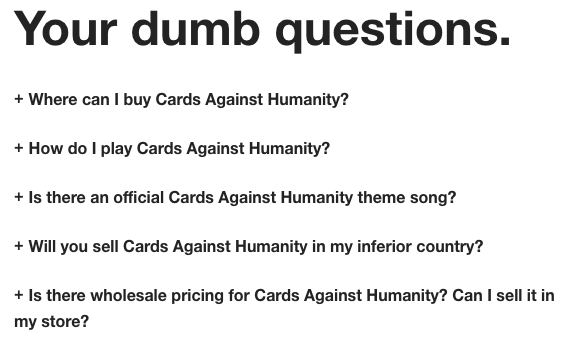
Here’s a sneak peek into some of the answers to these questions. You’ll see they make fun of both themselves and the reader — which is exactly what the card game is about.

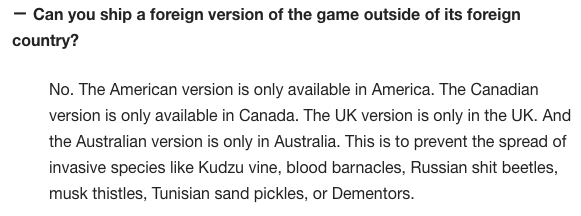

10. R/GA
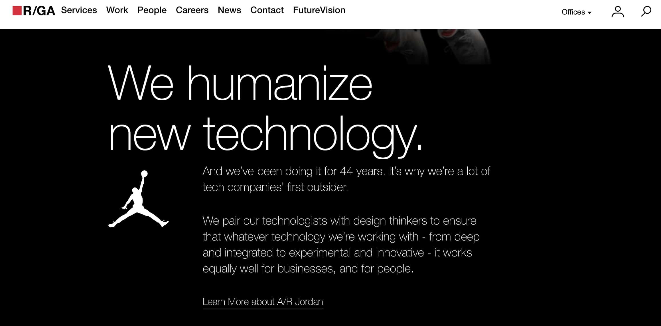
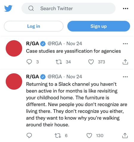
Why we like it: B2B companies are not exactly known for their humor. R/GA bucks that trend with hilarious hot takes via social media. This light approach makes them more relatable and helps build brand awareness.
I’ve been focusing a lot on site copy so far, so I wanted to check out some examples of excellent social media copywriting.
I know you all like to see some more B2B examples in here, too, so I surfaced one of the best examples of the holy grail: Twitter copy, from a B2B company, that’s funny. Behold, some recent highlights from the R/GA Twitter account:
11. innocent

Why we like it: Like Velocity Partners, innocent’s copy proves that simple language can be just as effective as its more descriptive counterparts. There’s no need for long paragraphs, innocent gets straight to the point.
Check out U.K.-based drink makers innocent, and you’ll see a language, style, and tone that matches their philosophy, product, and even their branding and design. It’s all just clean, straightforward, and simple. And believe it or not, simple is a really, really hard thing to nail in copywriting.
This stands out most on their “Things We Make” page. (Isn’t that page name even beautifully simple?)
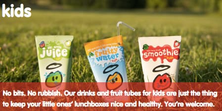
This same straightforward-but-charming copywriting philosophy extends to their site navigation:

Their meta description is pretty awesome, too:

And my personal favorite:
12. GymIt

Why we like it: GymIt truly gets their users and expresses it with funny advertising about pretending to move to get out of a contract. The company knows their audience and knows just what to say to hook them and make them smile.
I’ve always loved the copy at GymIt. In fact, I check their site and social profiles all the time to see if they’ve freshened anything up. Luckily, they’re no one-trick pony. They continue to keep their site fresh with captivating copy.
Here are some of my favorites, all of which hit on the pain points of gym-goers that they try to solve — and actually do solve with their customer-friendly policies.
I can vouch for that one. I know how much of a hassle it is to move far away from your gym — and how refreshing it must be to be able to walk in and just … quit.
All of this rolls up to their philosophy, espoused eloquently on their “About” page, that gyms should just be about working out:

Talk about having an understanding of their core audience. The copy both in its value proposition and across its marketing materials reflects a deep understanding of their customers.
And how did their copywriters choose to make sure everyone knew what this new gym franchise was about if they didn’t read that “About” page? This tagline:
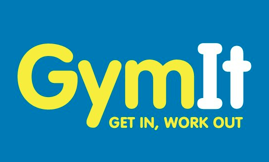
Doesn’t get much clearer than that.
13. ModCloth
Why we like it: ModCloth is delightfully quirky and whimsy. Their copy speaks directly to their buyer personas with product copy that helps buyers envision their lives with the item.
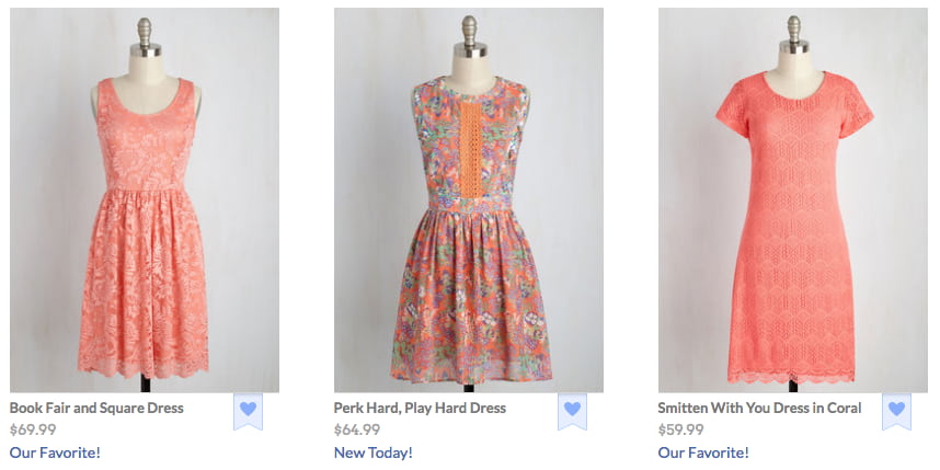
ModCloth is a brand that has always had an excellent grasp of their buyer persona, and it comes through in their pun-filled copywriting. All of their products are silly plays on words — check out this screen grab of some of their new arrivals, for example:
Dive into their product description copy, and it’s equally joyous, evocative, and clever — just like their customers. Often, it’ll also tell the story of what you’ll do while wearing their items:
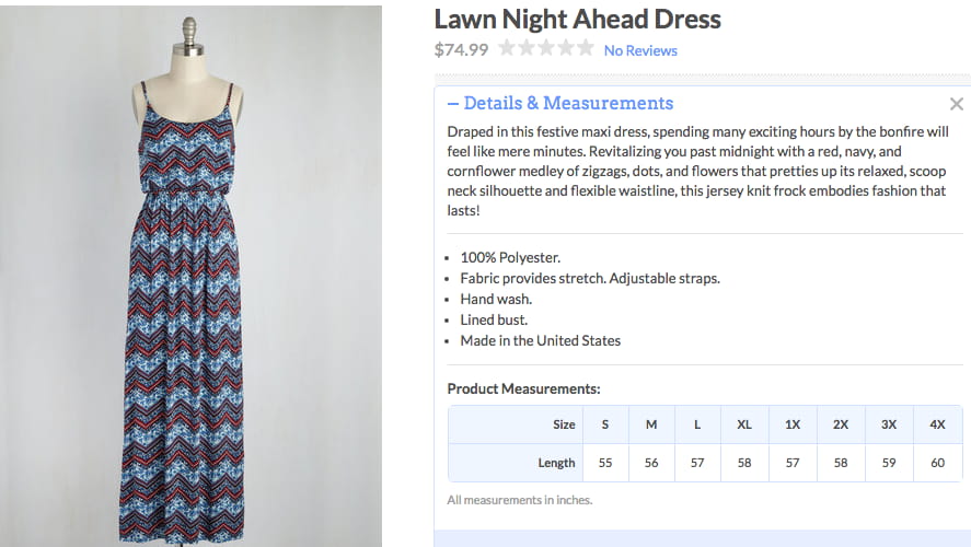
After reading their descriptions, one can imagine what their life would be like if they owned this product. That’s Copywriting 101, but so few brands can actually pull it off like the folks at ModCloth do.
14. Ann Handley
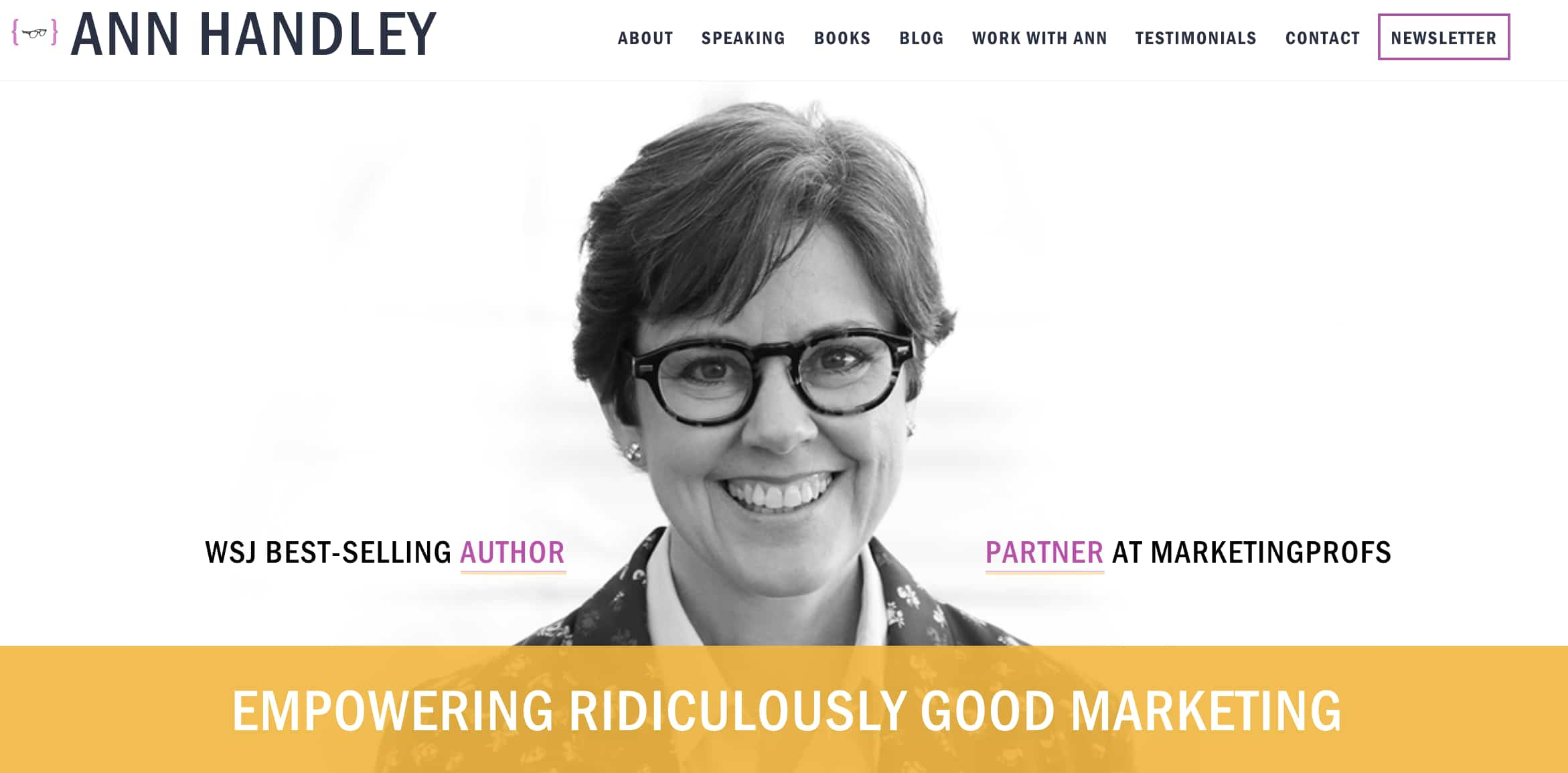
Why we like it: Despite an impressive portfolio and list of accomplishments, Ann Handley makes her site copy relatable instead of just reading like a resume. It’s the perfect balance of personality and professionalism.
When it comes to building up your own personal brand, it can be easy to get a little too self-promotional. That’s where the copywriting on your site can make a big difference.
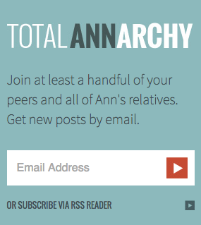
On Ann Handley’s personal website, she added bits of microcopy that shows, despite her many accomplishments (like being a best-selling author and award-winning speaker), that she still doesn’t take herself too seriously.
Check out her email subscription call-to-action, for example:
Flex Your CopyWriting Muscles
Anyone can be a successful copywriter with the right brand voice — and a little editorial guidance along the way. Get inspiration from the brands above or start compiling your favorite examples.
This article was originally published January 17, 2019 and has been updated for comprehensiveness.
![]()


